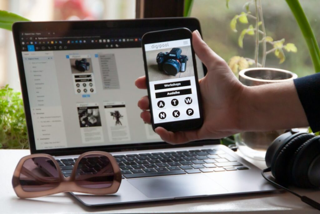
How to make a website mobile friendly starts with a responsive layout that adapts to any screen size, then adds a few performance tweaks.
Key Takeaways
- Use a fluid grid or CSS framework to let elements resize.
- Set the viewport meta tag so browsers know the page width.
- Compress images and serve modern formats.
- Test on real devices, not just emulators.
- Avoid intrusive pop‑ups that block content.
What Does “Mobile Friendly” Actually Mean?
A mobile‑friendly page automatically adjusts its layout, images, and navigation to fit the screen size and orientation of a phone or tablet. The result is a consistent, readable experience without horizontal scrolling or tiny tap targets.
Why Should You Care About Mobile Friendliness?
Google now indexes the mobile version of every site first, so a responsive design can improve rankings. Beyond SEO, faster load times and legible text keep visitors engaged, which reduces bounce rates and boosts conversions.
Step 1: Choose a Responsive Layout Method
Two common approaches work for beginners:
- CSS Flexbox/Grid: Write your own stylesheet using
display:flexordisplay:grid. This gives fine‑grained control and works in all modern browsers. - Pre‑built framework: Bootstrap, Tailwind, or Foundation provide ready‑made breakpoints and components. Pick one if you want speed over custom code.
Both methods rely on a fluid grid that scales columns based on the viewport width.
Step 2: Add the Viewport Meta Tag
Place this line inside the <head> of every HTML page:
<meta name="viewport" content="width=device-width, initial-scale=1">The tag tells browsers to match the page width to the device width, preventing the default zoom‑out view that makes text unreadable.
Step 3: Optimize Images for Small Screens
Large images slow down mobile connections. Follow these practices:
- Resize images to the maximum display size you need.
- Save as WebP or AVIF for better compression.
- Use
srcsetandsizesattributes so the browser selects the appropriate file.
For example, an image displayed at 300 px wide on mobile should not be served as a 2000 px file.
Step 4: Minimize Page Weight and Improve Speed
Mobile users often have slower connections, so keep total page size under 2 MB when possible. Strategies include:
- Enable gzip or Brotli compression on your server.
- Combine and minify CSS and JavaScript.
- Leverage browser caching for static assets.
These steps boost performance, which directly influences mobile rankings.
Step 5: Eliminate Intrusive Pop‑Ups
Google penalizes pages that display pop‑ups covering the main content on a small screen. If you need a newsletter sign‑up, use a slide‑in that appears after the user scrolls a bit, rather than a full‑screen overlay.
Step 6: Test on Real Devices
Emulators are useful, but only real phones reveal issues like touch‑target size or OS‑specific rendering quirks. Use services like BrowserStack to run your site on a range of devices, or simply check on a personal smartphone.
Common Mistakes Beginners Make
Even after following the steps above, some pitfalls still trip up newcomers:
- Fixed‑width containers: Setting a container to 1200 px breaks on small screens.
- Neglecting font sizes: Tiny text forces pinch‑zoom.
- Overusing absolute positioning: Elements can overlap when the viewport shrinks.
Review your CSS for these patterns and replace them with relative units like percentages or rem.
How to Verify Mobile Friendliness After Changes
Google’s Mobile-Friendly Test tool provides a quick report. Enter your URL, and the tool shows any rendering problems and suggests fixes. For a deeper audit, run Lighthouse in Chrome DevTools and look at the “Performance” and “Accessibility” scores.
Our own SEO team often references the Hostinger tutorial for a concise checklist, and the BrowserStack guide for testing tips.
When you’re ready to apply these steps to a client site, you might consider a professional link‑building audit to ensure the new design doesn’t affect existing backlinks.
What to Do Next
- Audit your current pages with the Mobile-Friendly Test.
- Choose a responsive layout method and add the viewport tag.
- Compress images, enable caching, and retest on at least two devices.
Choosing Between CSS Grid and Flexbox for Mobile Layouts
Picking the right layout engine is the first technical decision you make. Many beginners default to Flexbox for everything, but that approach often leads to fragile code. Grid is better for two-dimensional layouts, like a card gallery that needs to wrap evenly.
Flexbox excels at one-dimensional flows, such as a navigation bar that stacks on small screens. If your design involves complex alignment of rows and columns, use Grid. If you are arranging items in a single line that might wrap, Flexbox is simpler and more predictable.
When to Skip Frameworks Entirely
Before installing a heavy CSS framework like Bootstrap or Tailwind, ask if you need it. For a simple landing page or blog, native CSS with Grid and Flexbox is often lighter and faster to load. Frameworks add utility classes that bloat your stylesheet.
If you are working on a large team with strict design system requirements, a framework saves time. For a solo developer building a small site, native CSS gives you full control without the baggage. The trade-off is speed of development versus page weight. Slower pages hurt mobile users on data plans, so weigh that carefully.
Handling Touch Targets and Input Fields
Mobile users tap, not click. Small buttons and tight spacing cause frustration and accidental taps. The general recommendation is a minimum touch target size of 44 by 44 pixels. This buffer accounts for finger size and finger movement. If your design has 30-pixel buttons, you are fighting the hardware.
Increase the padding or the element size. Do not just scale the font; scale the clickable area. This applies to links in text, too. A link inside a paragraph needs surrounding space to be easily tappable.
Fixing Form Input Issues
Forms are where mobile friction peaks. The biggest mistake is using the default keyboard for all fields. If a user is entering a phone number, they want a numeric keypad. If they are entering an email, they want a keyboard with an @ symbol. Use the appropriate input type, such as type=”tel” or type=”email”.
This tells the browser which keyboard to show. It saves the user from hunting for symbols. It also reduces input errors. Always test your forms on a physical device. Desktop emulators often behave differently regarding keyboard focus and scroll behavior.
If a field is hard to find or the keyboard covers the input, the user will likely abandon the form.
Managing Navigation for Thumb Reach
Most users hold their phone with one hand. The bottom of the screen is the easy zone. The top corners are the hard zone. If your primary navigation is stuck at the top, users have to stretch their thumb or switch hands. This is a subtle but significant usability barrier.
Consider a sticky bottom navigation bar for core actions. This keeps the most important links within easy reach. If you must keep navigation at the top, ensure it is compact and clear. Avoid long lists of links in the header. Use a hamburger menu for secondary options, but keep the primary actions visible.
The goal is to minimize the physical effort required to navigate your site.
Dealing with Sticky Elements
Sticky headers and footers are convenient, but they can eat up valuable screen real estate. On a small phone, a tall sticky header can hide half your content. Keep sticky elements slim. If you have a sticky footer, ensure it does not overlap the main content when the keyboard opens.
Test the interaction between sticky elements and scroll positions. If the user cannot see the content they are reading because of a fixed bar, you have created a problem. Sometimes, the best sticky element is none at all. Let the user scroll freely to the top if they need to reorient themselves.
Balance convenience with visibility.
Testing Beyond the Browser Emulator
Browser dev tools are excellent for quick checks, but they are not real devices. They simulate the viewport, but they do not simulate the hardware. They do not simulate the battery drain, the heat, or the actual touch latency. You must test on at least one low-end Android device and one iPhone.
These represent the two main operating systems and the range of hardware capabilities. Check how your site behaves on a 4G connection versus Wi-Fi. Slow connections reveal performance issues that fast lab environments hide. Look for layout shifts as images load. Watch for buttons that are hard to press.
Listen for the silence of a smooth scroll. If it feels sluggish on a real phone, it is sluggish for your users. The emulator is a starting point, not the finish line.
- Check font rendering on different screen densities.
- Verify that video and audio controls are large enough.
- Test the site in both portrait and landscape modes.
- Ensure that text is readable without zooming in.
Frequently Asked Questions
Do I need a separate mobile site?
No. A single responsive site serves both desktop and mobile users, simplifying maintenance and avoiding duplicate content.
Can I make an existing site mobile friendly without redesigning everything?
Yes. Start with the viewport tag, then progressively enhance the CSS grid or add media queries for key breakpoints. Many sites become usable with minimal code changes.
How often should I test for mobile friendliness?
Test after any major layout change, new content addition, or when you notice a drop in mobile traffic. Quarterly checks keep you ahead of browser updates.